
Dashboards your team actually uses to make decisions
We turn scattered spreadsheets and manual reports into dashboards people trust and act on.
Most reporting fails not because the chart is wrong, but because nobody agreed what decision it should drive. We start with that: who looks at this, what call do they make, and what does good look like? Then we build.
What we deliver in data visualisation
Tableau dashboards built around the decision, not the data
For teams who have Tableau (or want it) but need dashboards stakeholders actually rely on to make decisions.
Learn morePower BI consultingPower BI reporting that runs itself
For finance and operations teams drowning in manual monthly reporting who want it automated, accurate and on time.
Learn moreReporting automationStop rebuilding the same report every month
For any team that spends days each month copying, pasting and reconciling data into a report by hand.
Learn moreCustom data web appsCustom data web apps when a dashboard is not enough
For organisations whose need has outgrown a BI tool: they need data capture, workflow, or a fully bespoke interface.
Learn moreRelated work
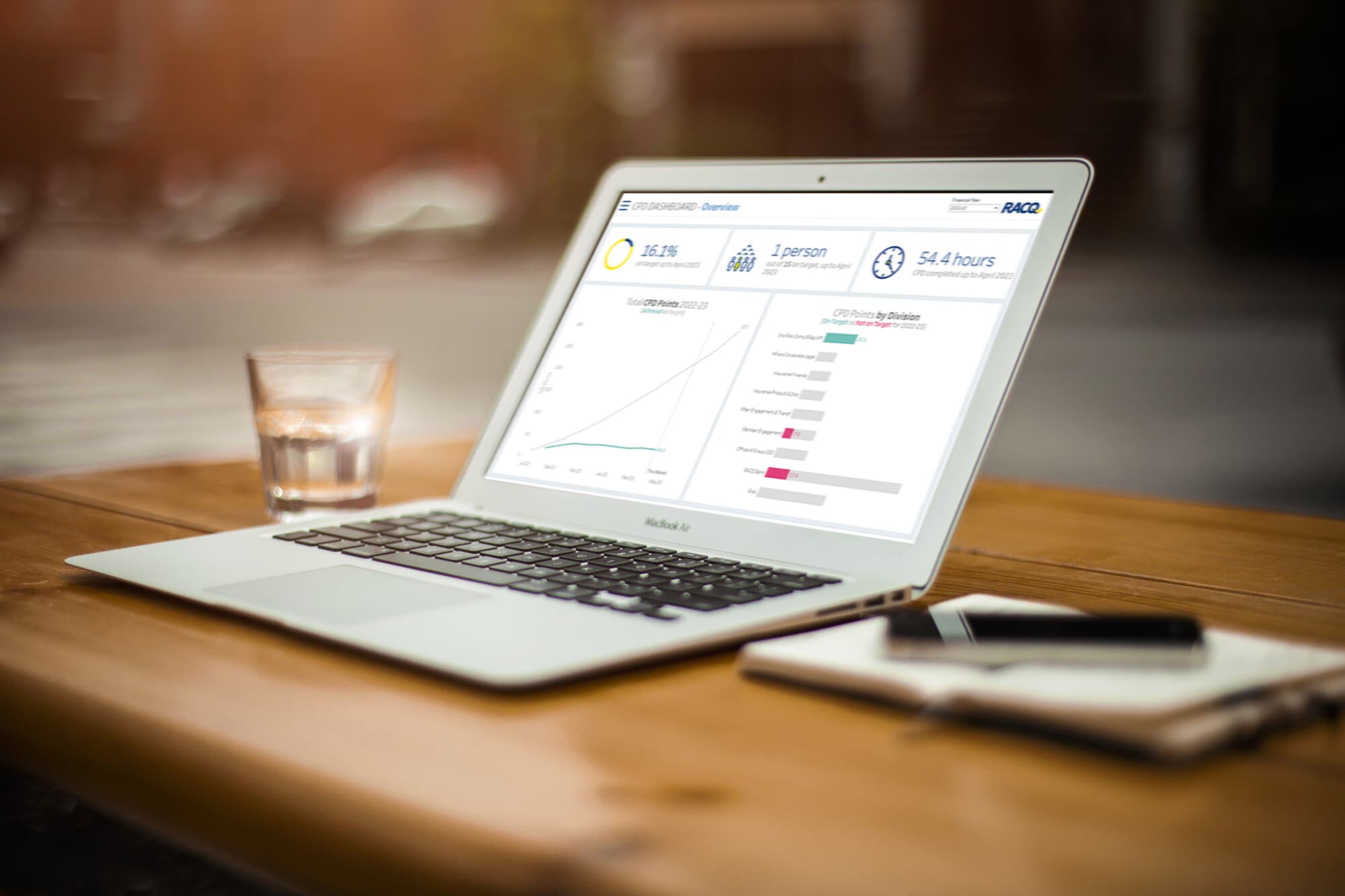
RACQ
We designed and productionised Tableau dashboards to track employees' professional development, automating data capture and helping RACQ refine training policy.
Clean, trusted dashboards adopted by stakeholders
Read the case study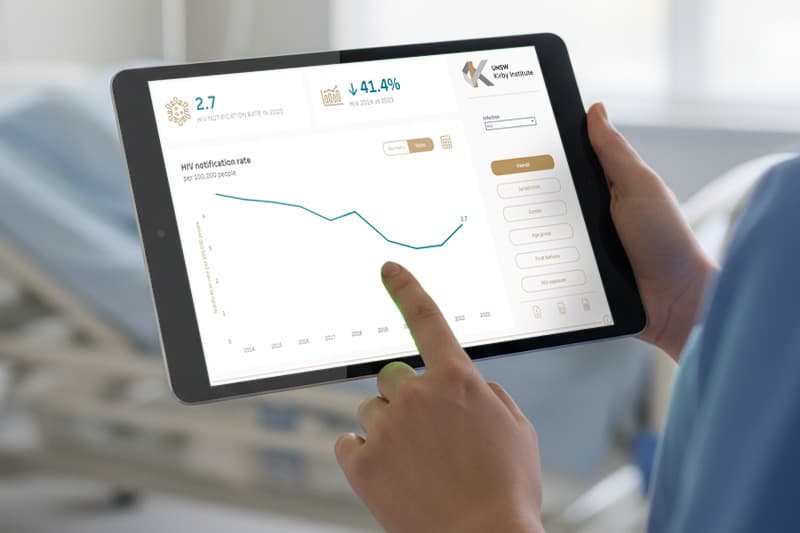
Kirby Institute (UNSW)
We built interactive Tableau dashboards tracking STIs across Australia, embedded in the institute's portal for exploration by region, gender, age group and infection type.
A new organisational standard for surveillance reporting
Read the case study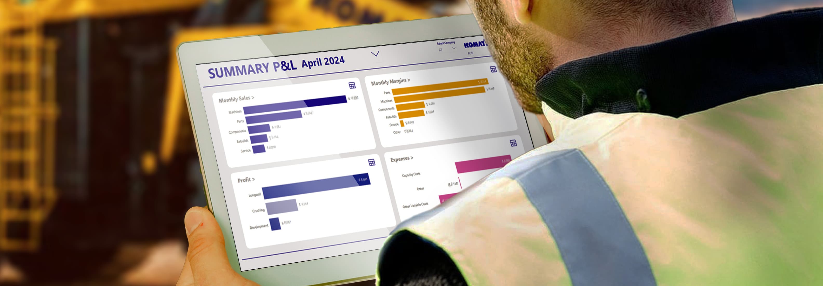
Komatsu Australia
We transitioned Komatsu Australia from a cumbersome manual process to automated financial reporting in Power BI, integrating data from SAP and Palantir Foundry.
50+ staff hours saved every month
Read the case study
Ready to get more from data visualisation?
We turn scattered spreadsheets and manual reports into dashboards people trust and act on.