
How to Build Responsive Icons in Tableau
A practical walkthrough for creating responsive icons in Tableau that recalculate on the fly to show whether a metric has improved, stayed the same or worsened.
13 January 2020 · 5 min read
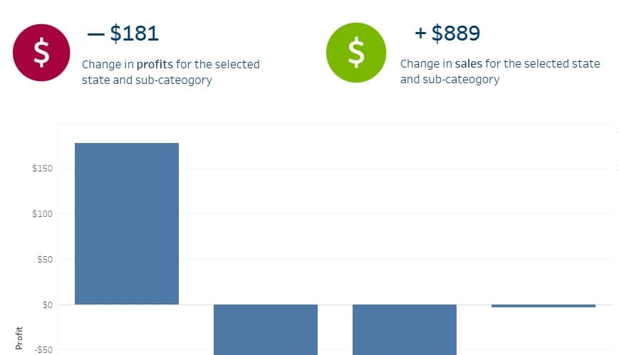
My team would tell you how I very often repeat that our mission is to use data to tell a story that helps decision makers make decisions based on evidence, in a way that positively affects our community.
To do this, in the last couple of years, my team and I have been experimenting with new ways to communicate data insights using Tableau. With so much (too much?) data at our disposal, we have started making use of more infographic-style visualisations, to give a quick summary of a metric to busy executives that don't always have the time to fully delve into a complex chart or a map.
One of the ways we have been doing this is by using responsive icons, that change to show whether a metric has improved, stayed the same or worsened compared to the previous year or a baseline.
I noticed however that there was not much documentation about using this technique, so I thought it would be useful to write a quick set of instructions on how to create responsive icons that get recalculated on the fly when making a filter or a parameter selection.
For this example I will use the Sample Superstore data in Tableau 2019.2, but the same thing can be achieved in most Tableau versions.
Step 1: Create a Calculated Field of the Change
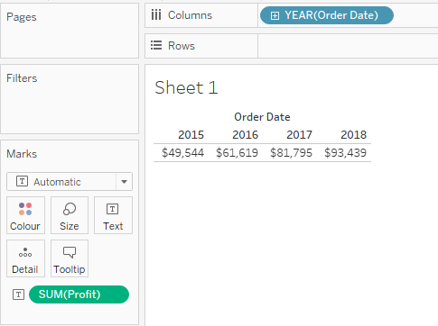
I took Profit and put it in a table to see how it changed from 2015 to 2018. There is a big difference between the sum of Profit in 2015 and the sum of Profit in 2018, so I will use that in my calculated field.
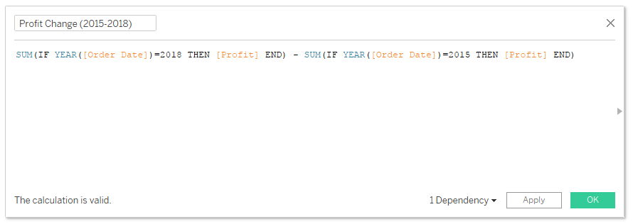
I created a calculated field called Profit Change (2015-2018) to calculate the dollar value difference between the profit in the two years. To do this I used the YEAR([Order Date]) formula to find what year each date is. Then I used two IF statements to find all values that are either in the years I am interested in. Using the IF without the ELSE means that when the condition of the IF statement is not fulfilled the calculation returns a null value. This makes no difference here but would be important if we wanted to calculate the average rather than the sum. This is the final formula:
SUM(IF YEAR([Order Date])=2018 THEN [Profit] END) - SUM(IF YEAR([Order Date])=2015 THEN [Profit] END)
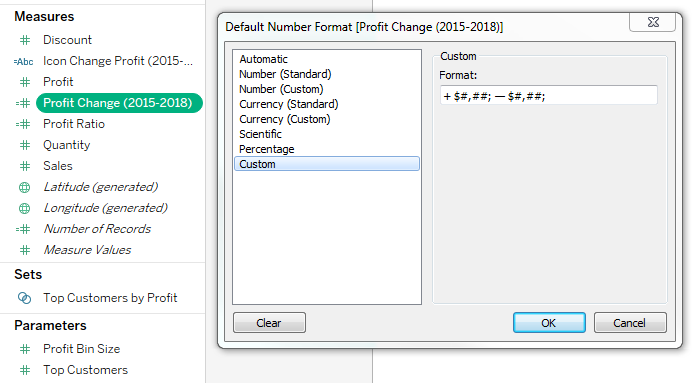
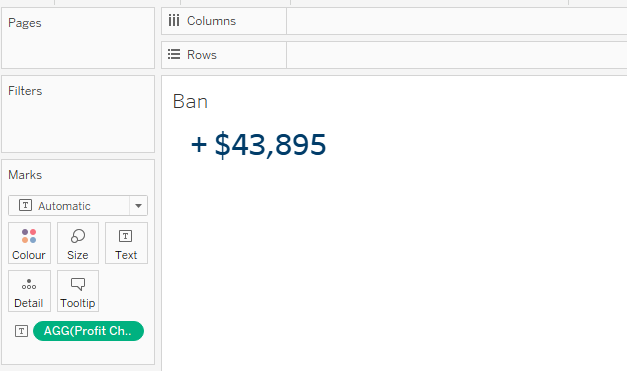
Since this is a change, I also added some custom formatting so that I can see a + sign when there is an increase, as well as the - sign when there is a decrease. To do this I right-clicked on the calculated field I just created, select Default Properties > Number Format and chose Custom. Formatting rules follow Excel's custom number format syntax. The format I used in this example is this: + $#,##; - $#,##;
By showing this as text, and after a bit of formatting, this is the result. We can later use this as our BAN.
Step 2: Create the calculated field to define your icon
In order to define how the icon will change, I need to create a calculated field based on the Change Profit field I have just created. This new calculated field, called Icon Change Profit (2015-2018), uses an IF statement to define some thresholds and returns a string of text like "Increase", "Stable" or "Decrease" depending on the result.
Here is the formula: IF [Profit Change (2015-2018)]>0 THEN "Increase" ELSEIF [Profit Change (2015-2018)]<0 THEN "Decrease" ELSEIF [Profit Change (2015-2018)]=0 THEN "Stable" ELSE "Error" END
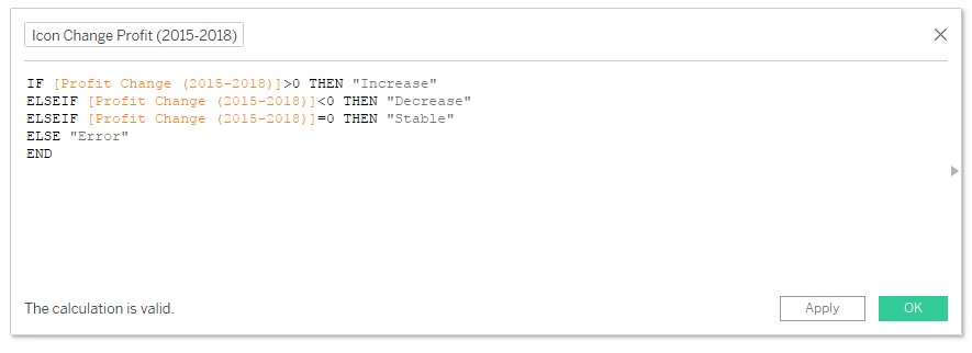
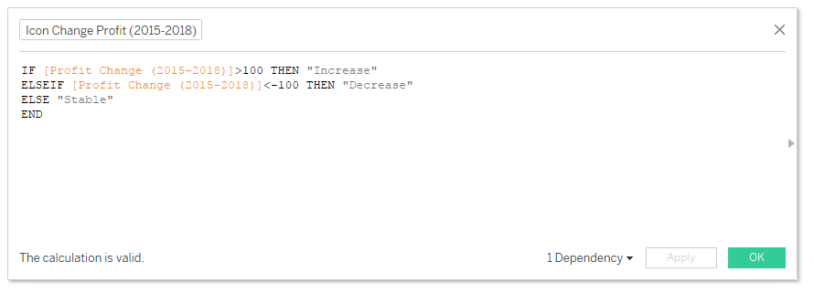
We don't actually need the "Error" part and, depending on the situation, it can be useful to just use ELSE "Stable", especially if we wanted to define "Stable" as a range, say plus or minus $100. In fact, let's do just that: IF [Profit Change (2015-2018)]>100 THEN "Increase" ELSEIF [Profit Change (2015-2018)]<-100 THEN "Decrease" ELSE "Stable" END
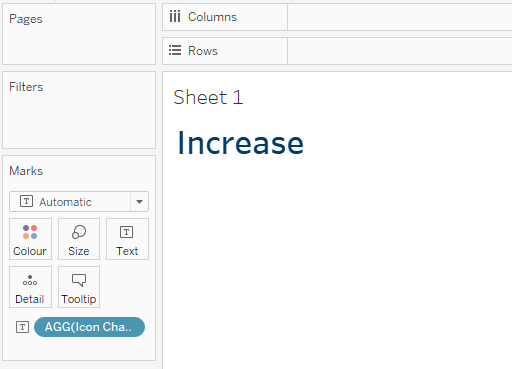
Now, I dragged the new calculated field in the Marks, leaving Columns and Rows empty. I ended up with this.
Step 3: Use Shapes to turn the text into an icon
The trick now is to change the Marks from 'Automatic' to 'Shape'. Then I dragged the calculated field onto the Shape mark. I then ended up with a circle. That circle stands for the text "Increase".
Now, I clicked onto the Shape mark to assign different icons to my text output. You can choose an icon from the default Tableau shapes available, or you can create your own icon and load it in the Shape folder in your Tableau repository.
I then resized the icon by using the Size mark. Here is the result.
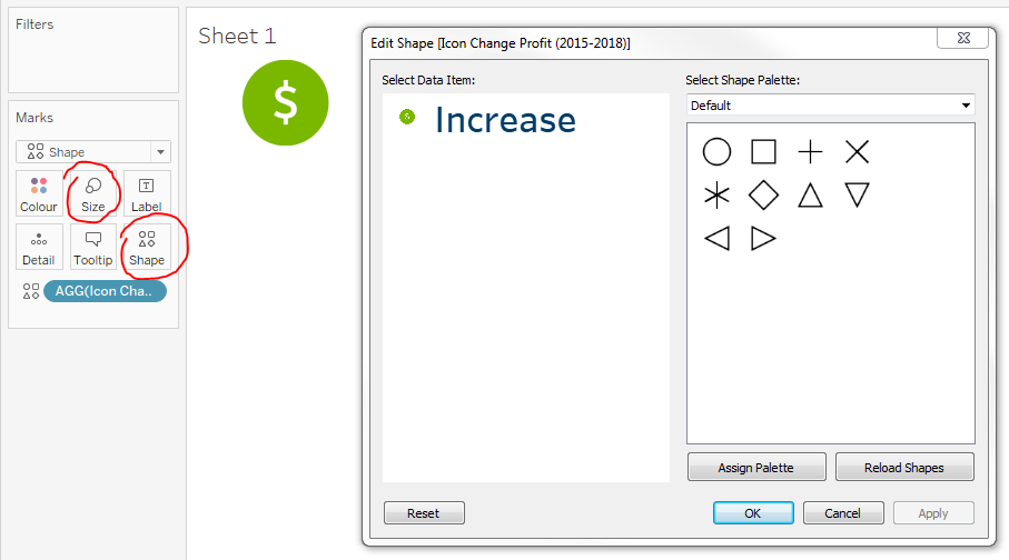
I make my icons in Photoshop, but you can use any image. My suggestion is to use a PNG image with a transparent background. You can use sites like Flaticon or The Noun Project, where you can find tons of ready-made icons.
You can now apply some filters and see how the icon changes automatically. For example I applied a Location filter and a Category filter to see whether the profit for Tables in California has increased, decreased or has remained stable since 2015. In this case it has decreased.
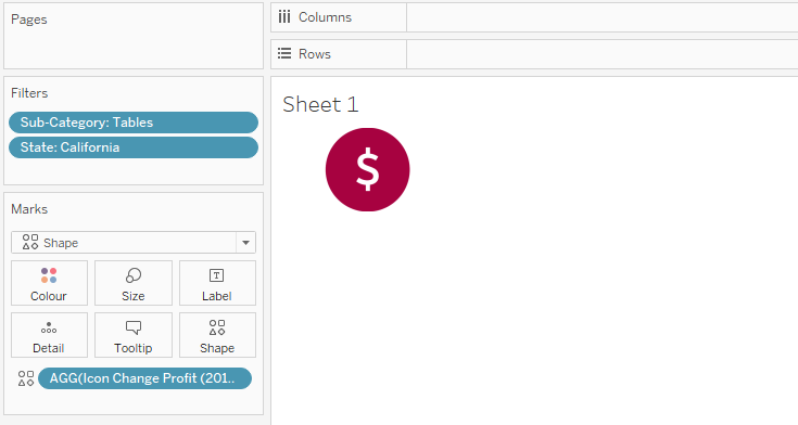
Assigning icons to the three possible results can be a little tricky. You can either put a Dimension into your rows or columns, or use filters to uncover combinations that produce all types of results you need to use. Then you can go into the Shape mark and assign different icons for different results. Alternatively you can use a black icon and use the calculated field we created to change the icon colour.
In this case, I assigned a green icon to "Increase", a red icon to "Decrease" and a Blue icon to "Stable". Here is where you can let your creativity run wild and see what works best for your dashboard.
Finally, I put the icon into a dashboard. I put it next to the BAN and added some text to explain what that number means. I then added some filters to control all dashboard elements simultaneously. You will need to make sure your filters are applied to all elements of the dashboard to ensure they work correctly together. The result is something like this.
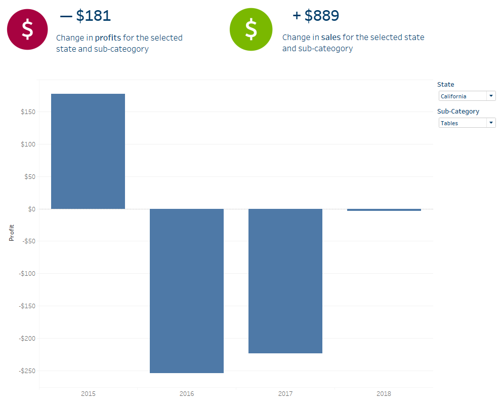
As you can see, I also added another icon showing the increase in sales for the same State and Sub-Category, so I could compare the increase value in sale and in profit at the same time. You can also use parameters as filters, so you can have the text below the BAN update automatically.
Conclusion
I hope this tutorial was helpful. If you would like a hand building responsive dashboards your team will actually use, get in touch.
A version of this article was first published by Dr Marco Motta on LinkedIn.
Related services
Want to talk it through?