
Measuring benefits with data visualisation
How interactive dashboards turn benefit management plans into measured, evidence-based benefit realisation for transport programs and portfolios.
4 August 2022 · 7 min read
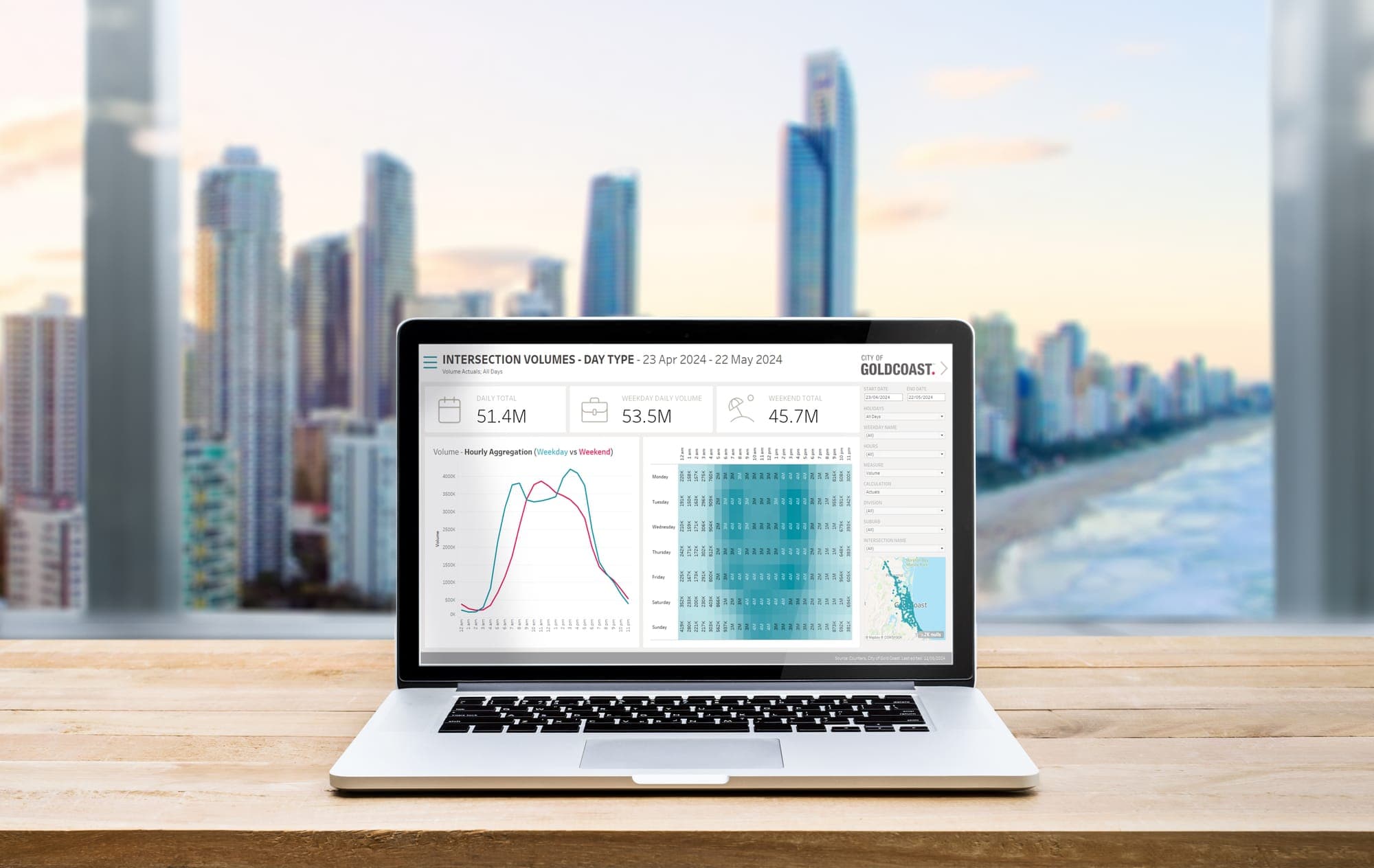
It is widely accepted that data is key to good decisions, especially within the transport sector. This is not so much because data can make us absolutely certain that an investment or a project will deliver the outcome we are hoping for. Rather, data helps us to be approximately right instead of precisely wrong, as Glenn Lyons put it in his 2019 address to the Chartered Institution of Highways and Transportation Learned Society.
However, data on its own often does not tell us much about what worked and what did not, or what we should and should not do. That one metric has increased while another has stayed flat or gone down does not, by itself, help us decide how best to spend the limited resources at our disposal to deliver the best possible outcome for the community we serve.
If data is the new oil, then just as oil is useful only once it is refined, data is only useful once we process it into understanding.
Stephen Few
Data is most valuable once it is refined, through analysis, into insight. Unfortunately, analysts do not always have all the knowledge required to fully unlock the potential of the data at their disposal. Much of that knowledge sits with industry experts, who do not necessarily know how to leverage the large amounts of data needed to substantiate or challenge what they already, in some sense, know. In this context the analyst becomes the connector between the data and the subject matter expert, and one of the most effective tools for making that connection is data visualisation.
From a benefits plan to a measured benefit
Many organisations spend real time and resources developing comprehensive benefits management plans to define the benefits their projects and programs aim to achieve. Far fewer manage to consistently measure those benefits at scale. To close that gap, our team spent a number of years building a comprehensive, interactive dashboard to manage the benefits realised across projects, programs and portfolios.
Most benefit realisation plans break performance down into key areas: customer experience, efficiency, safety, sustainability, and so on. Each key area is tied to an objective, and each objective is measured through key performance indicators, not unlike the OKR system Google uses to measure performance. The aim is to close the feedback loop, giving decision makers a clear view of how their investment decisions have delivered benefits to their customers.
Our benefit realisation dashboards show the performance of a program or portfolio over the previous five years, starting by measuring each individual KPI. To do that efficiently we use Alteryx for data manipulation (with Amazon Web Services when we need more processing grunt) and Tableau for visualisation, because both let us harness large amounts of data efficiently, effectively and transparently.
We could, in principle, do much of this with Excel, SQL or Python, but we would have been unlikely to develop and implement so many new metrics, especially the more experimental ones, with only a handful of people. The speed Alteryx affords us in exploring data and building metrics means we can quickly construct and audit key measures out of almost any data, whatever its quality or size, and its visual workflows need minimal training and documentation for new staff. Tableau, in turn, gives us a solid, flexible platform for visualising something as complex and multi-dimensional as benefit realisation, including infographics, charts and spatial data together in one place.
The scale is significant. Our benefit realisation dashboards often bring together more than 30 unique datasets (some with tens of millions of individual spatial objects), 20 to 30 metrics, 40 to 50 charts and maps, and hundreds of individual sheets, making some of them among the largest interactive benefit realisation dashboards in Australia, and possibly the world.
Designing for every kind of user
With that much information, the challenge is to serve very different users without overwhelming any of them. We start with a table of contents carrying high-level results and executive summaries, so users can quickly orient themselves and see the key highlights and commentary.
The layout then supports different levels of engagement. At the top, infographic icons give fast, high-level information to users who may only have a few seconds per metric, along with a visual cue of what the metric is and how it is tracking overall. Users who want more move to a chart or histogram, usually a time series on the left of the template, which can be split by filters into states, local government areas or postcodes. Users who want the finest detail move to a map on the right, which lets planners and project managers interrogate whether benefits have been realised in their specific area.
The real value is in the conversation
As proud as we are of the technical work, it is not the point. Data, even large and beautifully visualised data, is not useful on its own. The value comes from using those visualisations to unlock the knowledge of subject matter experts, and so raise the analytical maturity of the organisation.
To do that, we facilitate benefit realisation workshops, working through individual subject areas stream by stream, usually aligned to the key areas set out in a benefits management plan. The method is as simple as it is effective: we present the visualisation for each relevant metric, start by observing the high-level trend, then filter to finer levels to understand how individual results contribute to the overall picture. Then we ask open-ended questions, such as "why do you think this is happening?", to lift the discussion from what is happening to the reasons behind it.
That is where the expert knowledge that could never have been captured in the data comes in. Having worked through several interrelated metrics, subject matter experts start connecting trends: an increase in customer churn with a fall in network efficiency, or a rise in emissions with longer commutes. With a large number of metrics at their fingertips and the right questions being asked, it becomes far easier to draw connections between data that does not, at first, appear related. Together we weave those connections into a coherent story of how benefits have been realised across a program or portfolio.
Why it matters
By bringing all the data into one place, we give experts, analysts and, most importantly, decision makers a bird's-eye view of how their projects, programs and portfolios are performing, so decisions rest on all the relevant data rather than a single metric or, worse, hearsay. Aggregating the data also surfaces unexpected connections, which can shift funding decisions and even steer the strategic direction of an organisation. What we learn is then folded back into the executive summary and into each visualisation through Tableau's tooltips.
This process is critical for organisational maturity. It fosters a culture where funding decisions are made not only on data, but on the insight that comes out of the data, and where that insight is not taken in isolation but interpreted through the lens of subject matter experts and the many interrelated metrics that make up the overall performance story.
Our experience is that the effort of collating data across complex projects, programs and portfolios, building the right metrics, and visualising the benefits realised does more than provide a transparent way to assess performance or highlight good-news stories. Most importantly, it is an opportunity to proactively engage staff in objectively investigating the causes of complex problems and to surface opportunities for better prioritisation and improvement. The real value is the discussion itself: a setting where staff can freely offer their expert view of what the data and trends mean, and where evidence-based solutions can be crafted and raised with decision makers, so that decisions deliver the benefits the organisation set out to achieve, ultimately for the benefit of its customers.
A version of this article was first published by Dr Marco Motta on LinkedIn.
Related services
Want to talk it through?